This is a result after light build. As you can see second image misses something - namely refraction and specular colors - totally. Problem with specular color is I am using static lights in scene (except one directional light, which is stationary). I want to have detailed shadows - that is why I am using them. Problem with static lights is, their can create shadows, but they are not reflected. If I add dynamic light or stationery one, it produces reflection effect on leather surface, but I do not want to do this. This particular scene is an office room, with about 16 ceiling lights. I can not make them dynamic, because maximum is 8 (if I remember it correctly). On the other hand static lights have no reflection at all. Of course I could add some dynamic lights to scene at the places where static ones are, but it seems simply stupid. Then why in the world I need damned static lights at all? Any advice?
Another problem is reflection (look at chair’s armrests) they supposed to be metallic and have refraction effect, but they are simply dumb gray. Can anybody explain why this is happening, why model looks great in mesh editor and then looks terrible in game? Why it does not have any refraction?
Thanks.
I’ve experimented with reflection captures and while they help somewhat, I still have problems:
They do not seem to work in simulation mode - everything is dull grey again.
Armrests are more white, than chrome.
This is screenshot from game editor. Leather is ok, but armchairs too white… no chrome at all.
Anything can be done to make them look chrome?
It looks to me like it’s just your lighting setup. The reason they look better in the Static Mesh viewer is because it’s got good lighting. Your lighting is all flat and single tone and likely the reason it looks grey is because it’s reflecting the color of the walls. Grey walls means grey reflection. Change the color of the wall material and I bet the color of the chrome changes too. If you were to place that same chair in the default map scene, then you’d see clouds reflecting in the chrome.
Also what does your material for the chair look like?
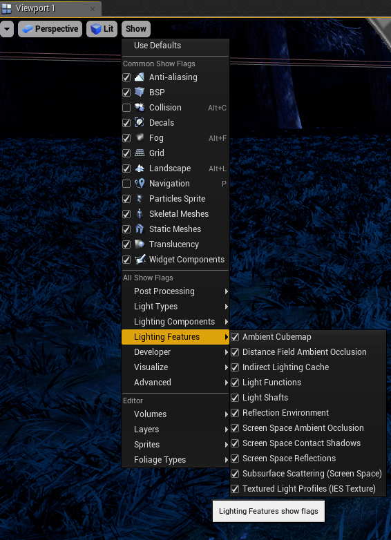
Finally, make sure that all of the engine features are turned on in your viewport settings. A crucial area to check is the LightingFeatures:
You may have answered your own question with regards to the lighting you’re using (static as opposed to stationary/dynamic where if I understand correctly the model renders like you want it to). Here is a post on answerhub in which the user seems to have a similar issue, while not using chrome you can see the major difference in how is material is rendered when using stationary vs static lighting. Static Light doesn't cast reflections - Rendering - Unreal Engine Forums
Another suggestion would be to tone down the skylight intensity if you’re using one in your scene. =)
Thanks for advices guys - hey were really helpful. What I found out so far: with help of reflection captures you can create really good looking scene. I do not have any problems with specular effects. Concerning chrome material: I found out it was affected by post processing volume (rendering features-> ambient cubemap->intensity). I was trying to use it as ambient light replacement, because sky light does not work as good as I was expected. I have a room with three windows and a directional light… plus skylight… and damned room is still dark. With sky light I can make it brighter, but dark objects still are too dark… it needs some minimum ambient level. So, above ambient cubemap works well, it increases ambient lighting, but problem is for whatever reason it affects reflecting surfaces and adds some white tint, making them dull and grayish.
Can anybody advise, how to increase ambient level without ruining reflection?
I was wondering if you were using ambient cubemap, but I couldn’t tell based on the screens. But yeah that’ll white wash the scene if you have the intensity too high. Subtlety is key when using ambient cubemaps or skylights, especially when indoor environments are concerned. You may also want to tone down your post processing ambient occlusion, it looks like you have some of that going based on your screenshot and that can give the room a darker look as well in the crevices/corners.
Can you show a screenshot of your lighting setup? You mentioned 16 lights, but that’s probably a bit overkill for a room of that size. You could get the same effect with 1 and playing around with the influence radius and maybe tweaking the light sources roughness a bit.
Here are my lights. Yes It is rather small room… nothing special - just some office. At the moment I am using 7 spot lights, 3 point lights, plus directional light and sky light. Of course I would like to use less lights, but found no other way. Two main reasons why I have so many ligths are: 1. I want to have nice, detailed shadows. 2. as it is daylight scene all items in room must be visible (not dark). As it was unable to achieve this with sky light only, I had to add other lights too.
In the first picture in OP, you are viewing the chair in asset viewer. In the asset viewer they have the Epic courtyard cubemap loaded in Skylight with “Lower Hemisphere is Black” being unchecked.
This might be a good example to try out 4.20’s rectangular area lights as opposed to having multiple light sources like that. It may allow you to get closer to the look you’re aiming to achieve.