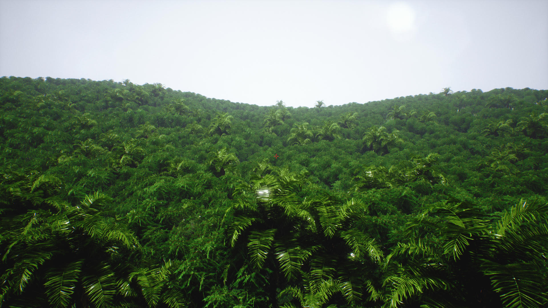
An aerial shot, about 30k trees are being rendered at once and each one is about 10k tris. Framerates are down to 30, but billboards aren’t in yet so that’s expected. I also need to improve the AO so I can turn off dynamic shadows, which are the main problem here.
With detail lighting:

Awesome models thats for sure.
However there doesnt seem to be enough variation in Height or Rotation in that scene, everything looks too similar.
I guess that’s because everything is so dense you can’t tell where the trees are. I’m planning to add some sort of color variation in the future, but for now I can fix the problem by just adding a bit more height variation and some more palm trees.

You should make a large jungle and put the first person (or third person) default in the scene. It would be cool to see a video of a character moving in the scene.
Just a thought.
Gorgeous! I play on Tanoa in Arma3 and I wish it’s jungles looked as good as this.
Is there auto geometry instancing going on here to keep the performance high?
30 FPS isn’t exactly what I would consider “high performance” but yes I think they’re all instanced.
I’m working on a larger environment now and I’m going to make a video of that, stay tuned:)
For some reason these screens:
Leave the impression of looking at top of a jungle (tree top level) rather than foliage on ground hmm. (Not saying anything is wrong with it though).
The only flaw in my opinion is that your colors are too saturated for something that’s supposed to be photorealistic.
Diddo. I thought it was the top of the forest until @Maximum-Dev pointed it out.
It IS the top of the forest. Did I say something about it being foliage on the ground?
I don’t think I’ll change the colors, I really think it looks better with vibrant colors. Many of my reference photos are highly saturated too, like this one: http://s1.it.atcdn.net/wp-content/uploads/2014/03/LapaRios-AerealView.jpg
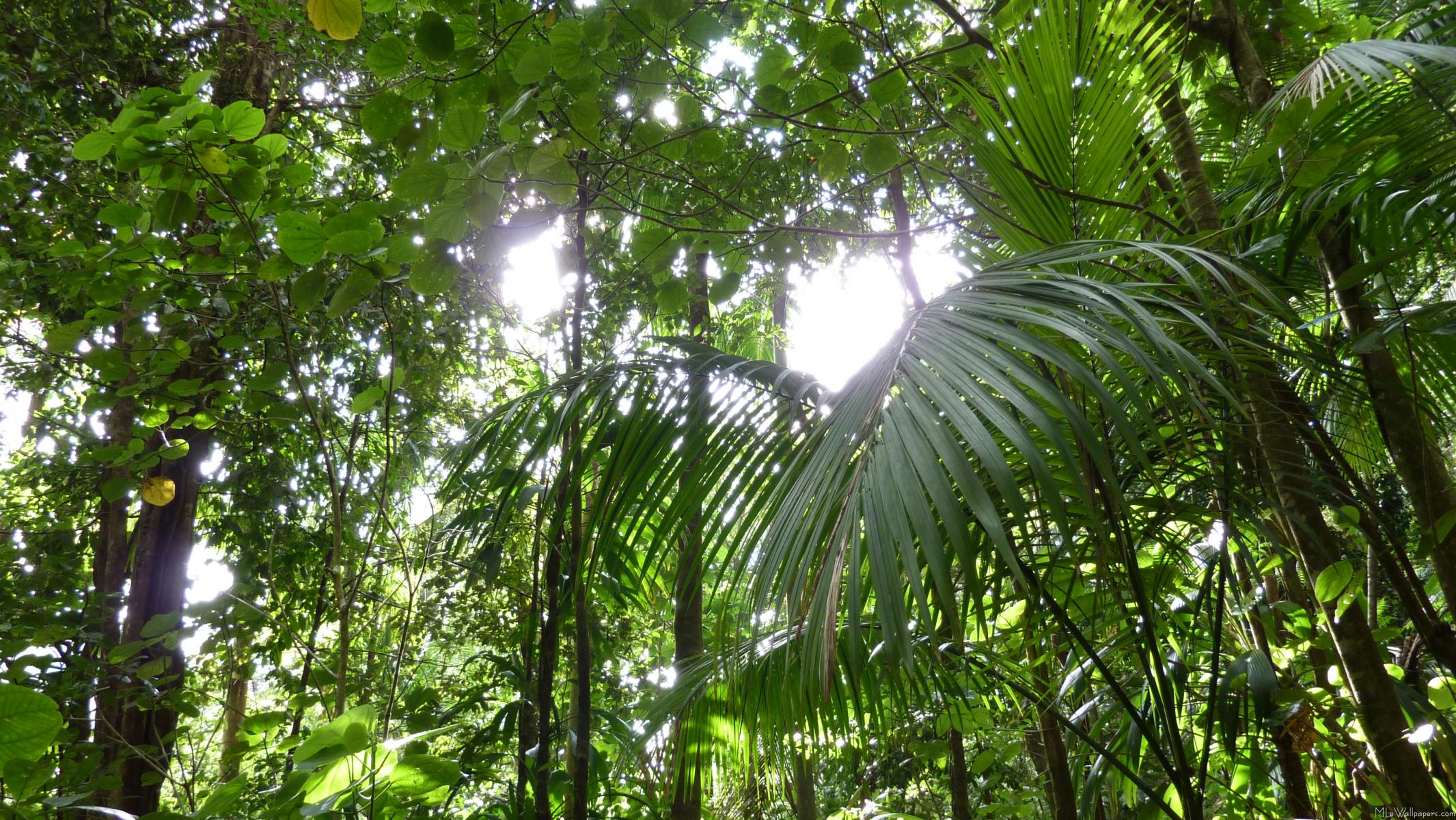
@Dogsofknowledge okay good! You should definitely keep the colors. Just make sure its not too dark under the tree cover. Maybe like this http://www.mlewallpapers.com/image/16x9-Widescreen-1/download/Sunlight-Through-Rainforest-Canopy-1033.jpg
At first I was like hey I’m looking at top of a jungle then when I scrolled down and saw this http://i.cubeupload.com/kwiMqL.png I was like hmmm, that must be the ground I’m looking at because that tree doesn’t look like a tall one.
The reference you linked is not realistic either (in terms of coloring). It’s heavily color graded picture. If you actually go there colors are way different. There colors in reality are more along these lines:

Your version:
Modified version (quick photoshop):
Another thing that helps making a more belieable result is macro color variation, can be achieved using PerInstance node or world position masking etc.
Anyway, just a piece of feedback. Ignore it if you want.
Goodluck
Wow, that’s a huge improvement! Having those colors definitely makes it look more like a photo, but saturated colors (at least in my opinion) make it more interesting to look at. Anyway, would it be possible to achieve those colors in UE4’s PP volume? Is it just decreasing the saturation or is there more to it?
Really cool though, thanks for the advice!
Working on materials currently, here’s a shot of a quick island scene I made using the community ocean project.
or photodreamilistic. (me dreaming of being on the island lying on a deck chair with a fresh drink ![]() )
)
Also take a look at how hugely varying the height differences is in the trees. The reference image has very large trees with much smaller trees sprinkled around the edges. Your scene is still very relatively uniform in height.
Yeah I know, I painted the trees in with a scale variation of 1 - 3 but all the big trees cover up the smaller ones so what you get are some wasted polygons. When I add more trees and a larger environment I’m going to place trees much more sparsely so the variation will be more visible.
It’s not oversaturated. I’ve been at Stanley Cay a few weeks ago and it actually looks like that there! Your shadows are a bit too strong maybe…

You can achieve this with Color Grading. Have a look at Color Lookup tables: Color Grading and the Filmic Tonemapper in Unreal Engine | Unreal Engine 5.3 Documentation