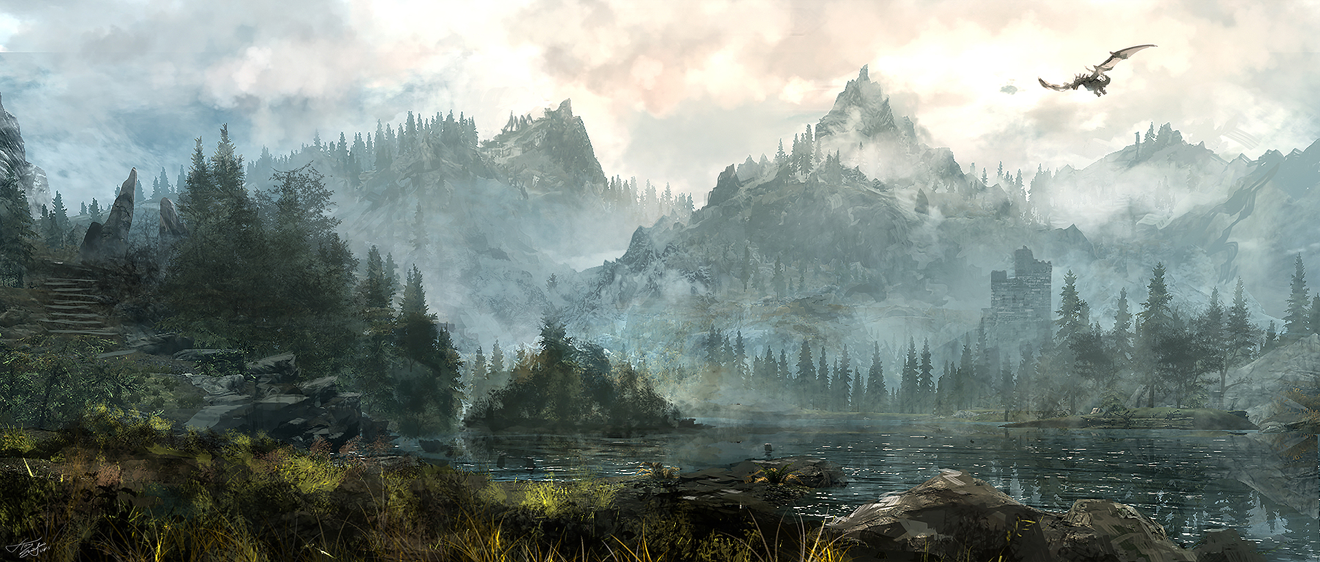
Here are the first shots of my little remake project. There will only be a couple of shots from some places.
http://s31.postimg.org/n34jlqym3/Capture3.png
http://s31.postimg.org/9rlwq5p6j/Capture5.png
That does not look like skyrim in any way.
The mountains lack of shapedetails
The godrays are… you just made them up they are not in vanilla skyrim
Water does not look anywhere near good as that on the pics…
The sky is completly made up too, i never saw that in skyrim
And where is all the snow and the dust?
Here are some skyrim themed screens:
http://www.playnation.de/uploads/gallery/2171/skyrim%20(8).jpg
Yes, I might was abit quick with sharing. Im good at that  Will work more on the next shots. Thanks for beeing honest, by the way!
I started over and used the mountain map from Epic. Here I also use TrueSky. How does it look now?
http://s31.postimg.org/aph3vk30b/Capture2.png
http://s31.postimg.org/6s91l1bnf/Capture3.png
http://s31.postimg.org/57m96f7ln/Capture4.png
much better but the lighting is a bit dull right now …what I would suggest is something I always do when making anything is to go look for references of what you think the people who made skyrim was inspired by… and once you collect enough photo references and pictures of what you want to achieve. You have the best result right there in front of you how it looks in real life. Now to make that into unreal is a lot of work . try starting with small elements and compare it with the original to see how much different it is to real life…and think how much further you can push it and repeat this cycle till you cannot do anything anymore that would be the final result of it in your progression to unreal realism… the more you work on it the better you get. Anyway when you show of areas always remember unreal has amazing post processing tools that can help you make the scene you have right now look a lot better with just a bit of colour correction and other adjustments .Try taking one of the pictures you took now and taking it to photoshop along with a Unreal LUT file and do edits in photoshop on the image with the lut fil e bellow your adjustment layer. once you think the colour and lighting looks right load the LUT in unreal and u will see huge changes . hope that helps. And don’t hurry to get an outcome… explore and learn and soon before you know it you will get there :-).You are already getting a lot better the mountains and the elements you have made are getting more and more to what you would want to get. keep at it!
Thanks for your feedback. I dont know why the scene is so dark.
I tried to tweak TrueSky and the lights itself
but it didnt help mutch. No luck with skylight either
Yes I have read something abut LUT, but I
dont fully understand what it does. Updates will
come tomorrow 
New shot. I figured out why the scene was so dark. I had postprocessing on:

Also tweaked the lightning abit more and the landcape.
Add some other tree types/variations, and set your tree spawning so that it randomizes the scale.
Agree. You should put some effort into the trees and also try to get some more detailed models/textures for them. Also I think the mountains are not high enough. Maybe it’s the perspective but it looks like they are just barely higher than the trees.
It’s starting to look pretty good, but the trees ruin it. You might want to check out Koola’s snow scene and use the trees that come with that.

