Today we are going to cook a rock! and rock with it!
I’ve seen the work all of you guys have been doing for a long time, and that’s wonderful. I’m not going to teach you anything, just want to shed some light IF there is anybody here who is not very familiar with the subject. As a person who wasn’t familiar with PBR for a while ago I know documentations can be very confusing and hard to understand in the beginning. So I believe there are still a lot of misunderstandings for people who have not fully grasped the PBR workflow, and differences between each PBR system. Yes each game engine’s PBR system is very different from the other. For example CRYENGINE uses the Specular workflow where Unreal Engine 4 uses Metalness workflow and Marmoset does something else…
What is the point of PBR?
PBR or Physically Based Rendering is a set of rules to follow when making textures and materials and the point is to make them look good under any lighting condition.
So, lets see what PBR does. Let’s say you have a rock diffuse texture map. If it’s bright, then it’ll look bright in game engine too. And if it’s dark, it’ll look dark in the game engine. Same story goes with specularity and glossiness. It’s actually you and the brightness slider and levels in Photoshop. Then how do you know where to put the slider, which value is the most correct? That’s where PBR steps in. It gives us a series of values related to different types of materials in real world so when you work according to these values you will have the same look in the game engine as you see in real life, (Yes that close). But keep that in mind not all values are available at the moment, but more will be made available sooner or later. For now we will deal with what’s already released.
With that being said, you know PBR workflow is different in every software and for now we will concentrate on Marmoset to start. So in the end you can use Marmoset to render your assets in a fully PBR compatible way. Quixel has provided a small chart giving us some of the values for the most common materials we need.

The first thing we have to do is set up Photoshop correctly. By that I mean we should switch to sRGB color space. To achieve that, we have to go to “Color Settings”. To get there we go to “Edit” and then select “Color Settings…”. The RGB should be set to sRGB and Gray to Gray Gamma 2.2.
By default, Gray is often set to Gain 20% which will result in a color transformation in the alpha channel. A value of 127 will come into the engine as 104 in that case which can cause inconsistencies, so please make sure Gamma 2.2 is used instead.
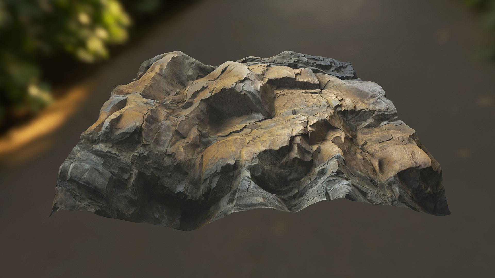
So now we want to make a rock material. There’s already one in the chart above so we’ll use that as a reference. Keep in mind not all rocks look like each other, or have the same values as each other. But until Quixel’s Mega Scans go live we have to wait and do the best possible.
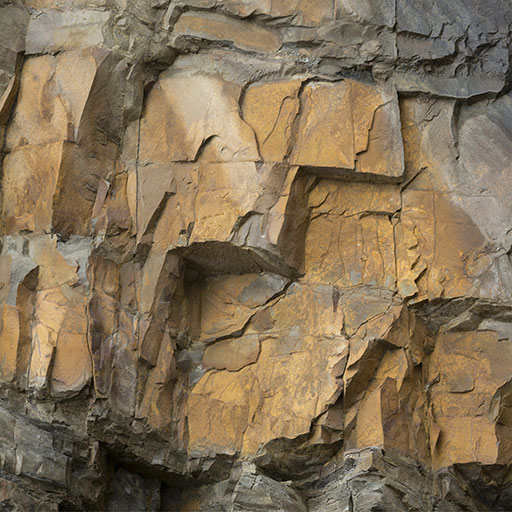
So you see 3 small squares in front of each material in the chart above. The first one is Albedo. Albedo is actually the same as diffuse. The major difference it has is it has to be clear from any lighting information. By that I mean you have to take out any directional light, or generally light, and any AO and shadows.
I just downloaded rock texture from CGTextures as I’m writing, and I didn’t touch it at all apart from a little photoshop for making it tileable.
(Size of images is lowered to 512x512)
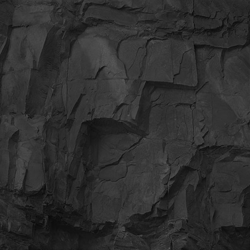
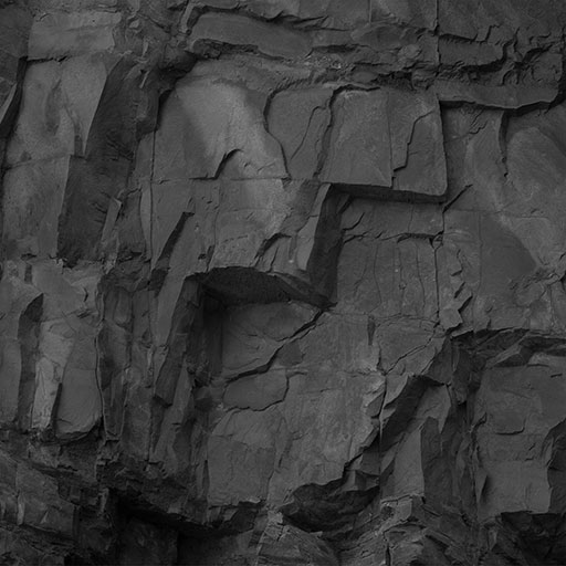
A quick way to remove all the lighting information is to duplicate the texture in a new layer, desaturate it and invert it (Ctrl+I) and put the blending mode on soft light. lightens the shadows and darkens the highlights. is not the best way and it takes more work but it’s the fastest for tutorial. Cheers to my friend Jack McKelvie for . But the proper way to do so would be either removing all the shading manually or using the Bitmap2Material 3 (Thank you ).
And there we go, open up the PBR chart in Photoshop and color pick the Albedo square of the rock material (it says “a” in front of the square). Create a new document (size doesn’t matter) and fill it with that color. What we will be dealing with from now on regarding the brightness of a texture is “Median”. For example when we say the median for rock is 147, you should adjust the brightness value for your rock texture as well until it’s median says 147. So where do we see the median? Click on the “Window” menu and then click on “Histogram”. will open a small box on the right side of the image editing space, click on the corner and hit expanded view. In the drop down choose “Luminosity” and then under the histogram you see Median value. So you are actually seeing the Median value of the color you have filled the document with. And that’s the median of the rock texture in Quixel’s chart and it’s 147. Now I go back to the rock texture I have and adjust the brightness until it’s Median says 147.
So here is what I ended up doing so,

The next step is Glossiness or Microsurface. Color pick the second square in front of the rock material and find it’s median. It’s 49. Desaturate your Albedo and go with it. Hopefully, there is no restrictions or guidelines for to follow. All it takes is a good artistic vision. If you want it look wet, push up the whites, or the other way. You are free to do whatever you want with it until you’re happy. But still, simply desaturating it and tweaking the levels just a little bit does the job for a typical look. But in the end keep median of the gloss map at 49.
Here is my gloss,
Next up is Specularity or Reflectivity. You’ll need your diffuse texture as it was before removing the lighting information out of it. So desaturate that too and tweaking the levels just a little bit does the job. It would look very close to the gloss map, the difference is it has those little shadows in the texture. I try to do it way because it gives me the similar result as Quixel’s Mega Scans. They have the shadows in their specular maps as well. In case median for the third square (specularity) is 63 which is a little close to 49. Keep at that and it’s ok.
He is my specularity,
You may say why do they have to look like each other? Gloss in marmoset would not be sRGB so it’ll look a lot brighter than specularity. But in Photoshop they look very close to each other because you are seeing both in sRGB color space.
And the last thing you would do is to create a normal map, and that’s not changed at all. So generate a normal map. I would say it’s also better to generate the normal map out of the diffuse you downloaded which includes the shadows in it. So it gives you some good depth. Make a displacement map too if you wish.
At last, Quixel’s Mega Scan rock material we were working according to:
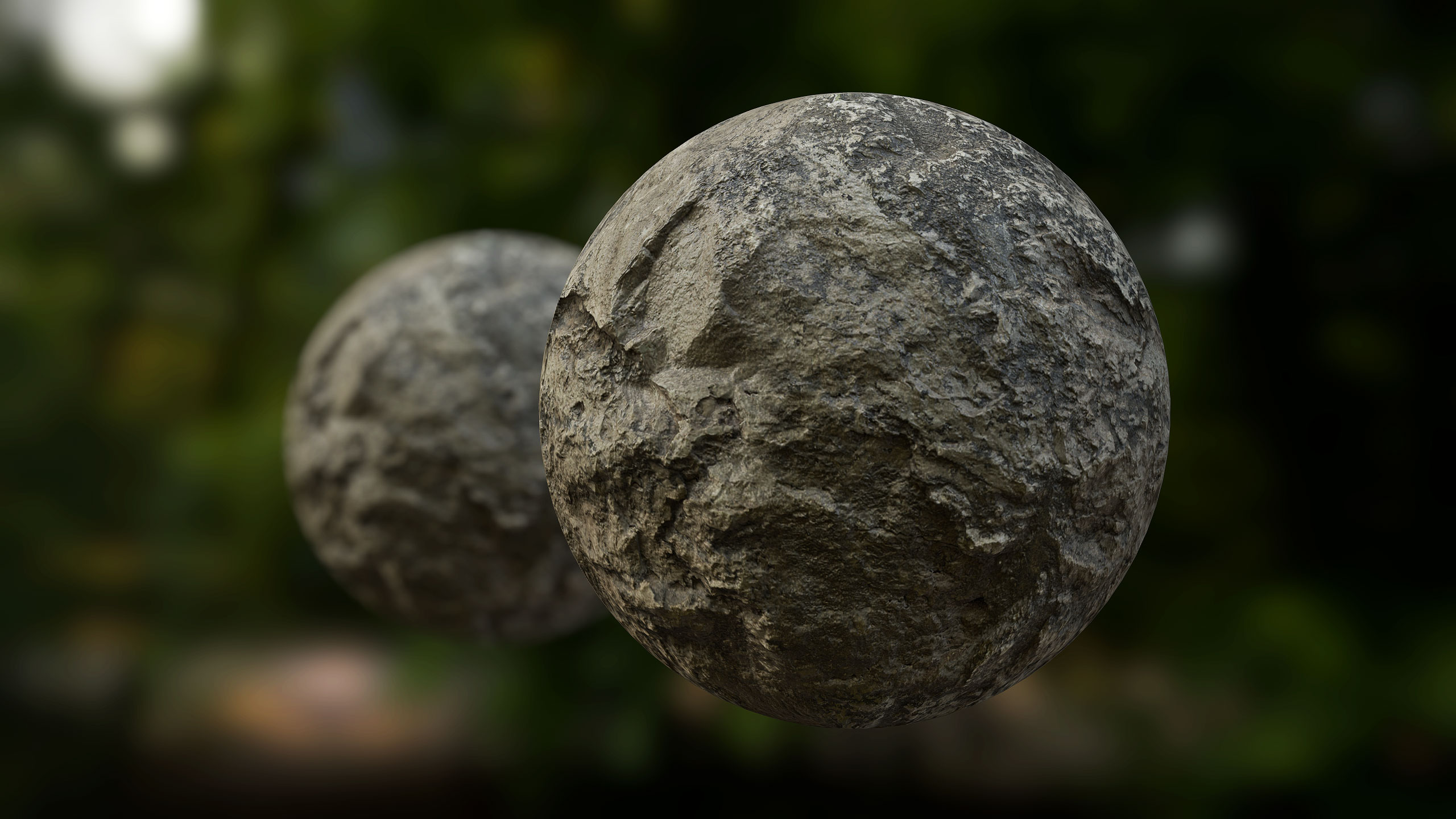
What I ended up with:
was the first part of the tutorial. The next part was planned to work with CRYENGINE’s workflow but that doesn’t feel right ATM to take a step towards that engine, also community has been so good to me in LFW section so I’d like to give something back. ![]()
If there was any questions feel free to ask.
And excuse me if there was any mis-spells.
Regards,
Alireza.
Other materials achieved using the same workflow:
.jpg)
.jpg)
.jpg)
_______________________________________________________________________
Tips:
-
When rendering your assets in Marmoset try disabling mip maps for diffuse, gloss and normal map for sharper textures.
-
Instead of applying sharpen filter to your renders try to sharped the textures themselves before you take the renders. But be careful to not abuse the sharpen filter.
-
We take out any shadow information from textures because our meshes have curvatures and curvatures create ambient occlusion and if we don’t take out the AO from our textures it will be multiplied with the AO that’s being applied on the mesh by the engine and results in unusually darker shadows. For textures you are creating for landscape/terrain surface or generally any surface that’s low poly like huge cliffs and things like that try to keep some shadow in the textures. is one place you would not want to remove all the lighting information because no AO is automatically happening on the ground surface or generally surfaces that don’t have much curvature and pure flat colors looks really bad.
-
If a surface wasn’t bumpy then it wouldn’t have much shadow/AO information on it. If you want good normal map for rocks and generally organic stuff generate it out of the diffuse before you eliminate the shadows so the normal map generator puts some good depth into it.
… I will be adding more
Ask any questions, and sorry for not having a video already.


