a trivial matter although i have to agree, ui bloat is something Epic seem unaware of, or maybe they just like it like that.
you can drag windows around and resize them ect but everything seems over-sized somehow whatever the screen resolution.
far worse than the 3d view are blueprints,
why do we need a giant rounded box for everything? with a huge ‘title’ area? and massive gaping voids all over the place? so much wasted space. it makes working with blueprints impractical and time consuming, and its so ugly and messy.
recently i was ‘playing’ with some quite complex maths in blueprints and its almost impossible to keep track of once you get past a handfull of nodes, directly due to bloat.
when you look at something like max/msp and compare it to ue4 blueprints its easy to that bloat just gets in the way.
UE4

Max
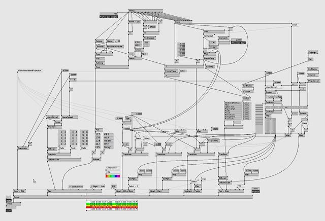
i know which one is prettiest but i also know which one is easier and faster to work with.
after all, gamers wont even see any blueprints while playing your game so whats the point?.
sorry to derail the thread a bit, its along the same lines though.