Marketplace Overhaul feedback

Hey guys!
First of all - gratz everyone with the release! :smiley:

Update 12/17:
Everything was fixed in next Launcher update
[HR][/HR]

It’s nice to finally see it in Launcher, but IMHO it comes with some serious problems. Maybe it just me and everyone else is ok(Judging from slack and twitter it is and now I feel like a ungrateful baddy), I want to share my concerns nevertheless.

I see some of the changes very damaging to the new content. What I can say from my experience and other popular products - release day is the one of the most important days of a product and now new people don’t get same exposure as we did. Actually it got worse in a couple of ways:

Featuring content:
Before overhaul: Some new products from the latest release were featured and some not
After overhaul: Currently(Dec 11)Content from November 11 is featured and content from latest release is ignored.

Sorting:
Before overhaul: All new products were put in the beginning of each section so you always can see new stuff on top. Basically frontpage of the marketplace = new releases.
After overhaul: Everything is alphabetical. Content that name start with “A” will sit on first pages forever. New content is hidden if it’s not starting with “A”. Frontpage of the marketplace = A-D assets.

Pages:
Before overhaul: We did not have any pages. If you open environment/blueprints/etc tab - you see everything.
After overhaul: There are pages now. If your content is not starting with A-D then most likely your content is hidden and user have to manually scroll through pages to find it

** Rating: **
Before overhaul: We did not have any. But we had correct rating in web marketplace
After overhaul: We have rating, but it does not include numbers of rating. So product with hundreds of 5-stars == product with one 5-star which you can give all by yourself. Why do you hide this data? WHY? It’s so essential and exist in every web market

** TLDR UX concerns: **
I don’t understand why new content and popular content is not promoted within Launcher, yet some old nov. 11 release and content which name start with A - is promoted. It seems so unfair - rating count number is hidden, no way of sorting by popularity or by date release(How it was previously). It so ridiculous that you will see same content in every category every day until someone release a project with “A… something” name =/ We had this problem in web version for year+, but most people was just using Launcher. Now we don’t have a choice and all problems are still there.

sorry

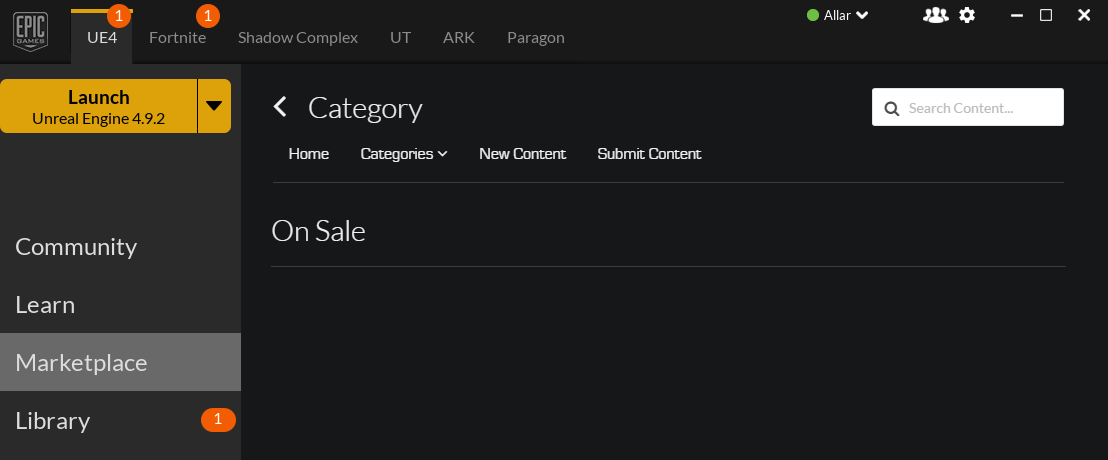
edit: Here is a pic to illustrate what this policy is forcing sellers to do. Find a pattern =/

As a marketplace seller and consumer, I think zeOrb nailed on the head what many, many people I’ve talked to about the launcher are concerned with. One thing not mentioned though is the performance decrease that came along with this new update. Scrolling seems much worse and is pretty painful. General responsiveness just seems… sluggish. I find this kind of odd as I’m running quite a beast system (and great internet) and still am seeing this slowdown.

Featured Content:

I really, really would like Epic to list why an asset is featured when its featured. I think this would not only increase sales for those featured items, it would give us sellers a better idea of what to strive for.

Sorting:

Alphabetical sorting by default makes no sense to me. Most recent by far was the best sorting method to avoid most of the issues you’ve discussed. Ironbelly (most likely unknowingly) had the right idea, naming all items with AAA. I have just requested a name change myself. I suggest you do the same. “A Prototype Pack: SuperGrid” perhaps. With this sorting change, it is very clear that you guys have the means of different forms of sorting, why not make this a user option?

Pages:

I really think the thumbnail source images should be scaled down to 128x128. Displaying them this large offers no additional information, especially when there is now enough vertical space to fit the name and author even with less width. Best case this would be literally a quarter of the image size of the current thumbnails, sourced at 296x296px but frequently displayed at 242x242 or less. Scaling to 128x128, or just smaller than what they currently are, would significantly reduce bandwidth and increase responsiveness.

The framework for async ‘lazy loading’ already exists, why use pages on category drill-downs when you start out showing everything? Weird user flow, and another reason I hope my name change request is accepted.

Ratings (and more featured content):

Restating what zeOrb said, while I love the fact that ratings are now shown, not showing the number of ratings an asset has greatly skews things. A newly released asset can be rated 5 stars by the seller (you are dam right I rated my own asset 5 stars) when released and cause a lot of disappointment.
Also, why are ratings not shown on featured content? That sort of gives users a “Take our word for it, even though we haven’t actually given you our word” type of feeling. Without other metrics like “Top Selling”, “Top Grossing”, “Most Popular”, which countless other marketplaces have, the ‘featured’ section loses a lot of meaning and turns Epic into this “ghost power”. Will I ever be re-featured? What does it take for an asset to be featured on release? My asset was on sale for Cyber Monday, and the sale was about the 'Top 10 Best Selling" assets, yet none of those assets were featured. Not even the top 3 that would have easily been able to be featured in the old launcher’s design were given no recognition, not that I could say what those were since data about this is non-existant. These are all the questions I have as a seller when I see ratings and featured content shown so… vaguely.

Categories:

PLEASE make category navigation be some form of sticky header, sidebar, anything. Scrolling is painful with this update and only makes category navigation worse. Its almost spiteful to list the “Environments” category on every asset when assets are only ever listed under their category already. Also, this was fixed prior to the update but came back again, the empty “On Sale” category resulting from blind parsing of the category list of the backend is visible once again, but now in the launcher:

But with all that being said, a lot more good came out with this update. Thanks Epic!

That’s some great feedback zeOrb and I agree.

Absolutely, first of all congrats again marketplace team on the new launcher and web marketplace. It’s definitely a huge improvement visually and with the ratings system.

I would also jut push for better exposure of content showing up by “release date” as well as number of ratings next to the stars. That would be an awesome start!
From there more filters and ability to organize by rating/number of ratings, alphabetically, newest to oldest, most purchased, etc. would be nice. To start though just the first suggestion as release week i would say is the most important. It’s always the biggest month of sales when a new product first comes out.

In any case, awesome work, awesome update so far, and I hope you all have a wonderful holiday season :slight_smile:

EDIT - I second what was said by Allar as well!

I totally agree. I would like to sort by newest and popularity along with the Alphabetical for each category, not just overall.

Awesome work on pushing out this update! =)

My thoughts exactly.

The first thing i noticed and was rather disappointed with was the lack of exposure for new content. It made perfect sense in the build before the overhaul that brand new content be at the very top of each category.

My first package i released is being displayed above and far infront of my most recent which makes no sense to me at all.

I could continue but everything else i feel has already been said by zeOrb and Allar.

Excellent re-tread of the old thread now with new Launcher!

  • Sorting Options (default should be latest i.e. Date Sort, Alphabetic, Alpha on Author Name) ← and their inverted equivalents (A-Z ==> Z-A)
  • Thumbnail size options
  • Dynamic banners for Sales % or Featured or Top Selling or (i.e. look to allar’s version)
  • Paging options (10, 20, 30, etc… )
  • Filters for ENGINE VERSION – I realize it’s supposed to be the TOP version of the engine, but a lot isn’t, and now you have to literally click every item to see what version of the engine it will work under. Not cool.
  • I cannot say this enough TAGS** – **everything should be filterable by everything above just because tags.

Author name? meta data == tag.
Last publish date? meta data == tag.
Engine versions, tag.

With tag filters searching == ridiculously fast (when indexed) and resolves the vast majority of problems.

  • auto tags for items I already own – ability to filter OUT items I already own
  • sort items I own but that have updates to a top list
  • Instead of clicking INTO a frame – click item in store, it should present on the side (this is more UX I understand, but…) readability and quick accessibility are my concerns here.
    something like a typical context item selection and property bag window:

&stc=1

Just to chime in I agree with all the feedback in the thread especially zeOrb and Allar. Both bring up good points. I think funky performance has been the biggest issue and a bummer that it got worse in the new version.

I would prefer the thumbnails go back to the smaller size. It’s just too much scrolling. Just think what scrolling will be like when the content doubles the current size.
On a side note, I think time is better spent on getting out the 4.10 updates and the (who knows how many) content in queue. I know of guys that have stuff submitted 8 weeks age.

The new launcher really eats up some cpu cycles. I have a 4 core (8 with ht) cpu and the launcher uses 12% cpu in the ‘Library’ tab and 3-5% cpu in all other tabs.

Same, but by launcher tab do you mean Library?

Yes sorry. Fixed it :slight_smile:

I like the new look, and features. Great work from the marketplace team. I have to agree with the overall consensus regarding feedback here though. Also wanted to report, someone mentioned in the feedback thread that they are unable to purchase products since the update. Anyone else experiencing that? Might want to look into it. Other than that good work. Happy to see many of these things finally implemented. Can’t wait to see the new seller portal next. =)

Well my pack description states compatible with 4.8 - 4.9 only even though i’ve sent the request over a month ago and it did actually stated 4.10 compatibility on the old marketplace so yea i’m not too pleased with the new one.

Looking superb and much nice functions. Only downside that scrolling down the items is quite slow. Takes much time to go through all items.

Kind of baffling that you still have the marketplace full of these one-time 5 star rated assets. It makes a joke of the system. More to the point, a temporary fix to only show ratings with at least a handful of data points would surely take all of about 5 minutes to implement. It just seems like a no-brainer. As does not having sorting default to alphabetical, as mentioned by everyone else.

A related request: Please just outright ban the terms ‘AAA’, ‘Advanced’, ‘High Quality’, and any other generic superlative for that matter, from appearing in product titles. It’s idiotic. Can’t sellers just make a product and let the buyers decide how good it is, rather than dictate to them in advance?

I have to agree with this, sure one can have worked in the AAA industry and have made the content… but its up to the buyer to decide if its that quality.
Might have saved van Gogh an ear if he could just have said: “Yo, dis paintin’s worth a million bro”.

Ok, all kidding aside, putting the marketplace from Newest to alphabetical was imho a very poor choice.
Also, I have heard from numerous people that they found it odd the IronBelly stuff has been up top for a rather curious long while now.
One even asked if it was promotion they paid for.

I highly agree with Allar and zeOrb on this.

On another note, I would really like to be able to control discounts on packs I made myself.
Perhaps to avoid abuse (i.e. make a pack 120,- and go 50% off! and keep it like that) being able to file a request a few days (not weeks, not months) ahead of time.

Ironbelly is AAA bro. Shouldn’t it be at the top for a long while? EVERYTHING they make is AAA. Seeing those letters just screams ‘look at me.’

I like those guys, they do good work. But the ‘AAA’ is just so nasty to look at, especially from a team that is clearly NOT AAA. AAA as in publicly traded, massively invested in. You are indie, why are you trying to be something you aren’t?

hey Osok, lots of love man, we like you too! :slight_smile: Totally understand where you’re coming from and we didn’t choose these titles lightly. What most people don’t know is that for 12 months before the release of the M9 we took all of the resources we had and perfected our weapons pipeline, running them by contacts in actual AAA studios and improving them until the confirmed that our weapons matched, or in most cases exceeded, the quality they demanded from their staff. (Being a small fish in Montreal with all these big cats has it’s advantageous at times). Now obviously AAA is a reference to the quality not the size or corporate structure of our studio, we fly our indie flag high and proud! That being said, given the enormous time and resources spent on each weapon to get them to the quality that a real world AAA studio would easily accept into a 10+ million dollar game, we’ve earned that AAA title.

I completely understand the potential for abuse if all of the other lower quality, lower cost ■■■■■ in the marketplace(some are just Unity assets brought straight over with minimal effort) to just slap AAA on their title and mislead people, in which case a more objective quality rating system could be in order but for now I definitely feel the AAA in the title was the best and quickest way, at a glance, to accurately distinguish our assets from the rest. Also for almost 7 years our motto has been “AAA quality at Indie prices” so our weapon packs are also an affirmation of that promise.

Thanks!

First I want to say I really appreciate all the hard work going to the engine, marketplace and everything surrounding this. So great job everyone!

As for the new updates, I think it is a great step forward! Software development is an iterative process. So I would like to add some feedback for a future iteration.

I agree with the feedback above and think with a few small tweaks and additions this will be a really great user experience.

Launcher Marketplace Design Changes
Smaller thumbnails should be considered
Amount of ratings should be shown
Sticky categories (stay on screen while scrolling)

Marketplace Home
Should show featured, popular, and new releases

Marketplace Category
Should have subcategories, tags, or filters
Sorting should be available

76948390f09a4a7aefe111ee3a947eb5ac8c8228.jpeg
a5ac7976340787ce3c4f8dd874decd499d02eae9.jpeg

No doubt you guys have earned the right to put AAA on those weapons - they look awesome. I however still agree with the sentiment that adding superlatives to any content pack isn’t appropriate. You could maybe get away with “Next-Gen” to signify the target audience and/or platform, but things like AAA, High Quality, Etc. simply indicates that the seller believes there are other packs that are low quality by comparison. If this is indeed a highly curated environment, why would Epic allow that in the first place? Seems counter-intuitive.

But honestly, this is borderline thread hijacking so I’ll circle back and say +1 to zeOrb and Allar, and I’m also very interested in Joviex’s idea (though a little concerned about how large it would make the desktop application).