The aim of the project is to be able to create buildings, vehicles and weapons using modular assets inside UE4. I’ve spent the past couple days remodeling&UV-ing assets from an old school project forUDK. Today I decided to drop a few into into UE4 and show my results. Please keep in mind these are WIP so its nothing to fancy just yet. All materials seen are placeholders.
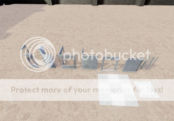
Corner types(windowed and not windowed), a double door doorway, a single wall section, pipe sections and some floor pieces. All UV’s need some work still.
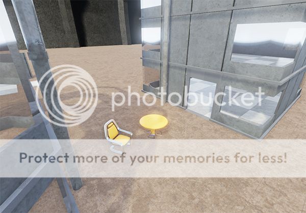
This is a scale+build test. The chair and table are the default sizes if brought in from content browser. Supposing a character is 180units tall I made the door height 205. VERY happy scale is exactly where I wanted it. The grey structure in the background is a 15meter high cement barrier that will come into use later on in the project.
As a curiosity, how easy is to “share” such assets? I mean, do you create a library and can use on your own projects, or you have to re-do everything everytime you create another project? I ask because I’m thinking about doing this for a project of mine, and would like to not only share with other projects, but to share with other developers.
Looking at the chair, and then the buildings… I feel that either the buildings are slightly too small, or the chair too big.
Even the higher hairs for the dinner table at home don’t reach half of the height of my doors. (which are 205 height)
I honestly think the buildings should be a bit bigger, or easier… the chair/table smaller.
By sharing do you mean like between maps or… (keep reading)
I do have an assets folder on my computer that is very well organized. There i keep models based on engine & type(like vehicles or building parts in this case) that i just drag and dop/copypaste where i need them.This project is RTS style so polys are pretty low and maps are massive. For a FPS i would do a higher poly for more details, like cracks or re-bar showing with a good normals bake. Usually I can just resize them but in this case i wanted to make it easier for ProGen to actually work right. My UDK stuff was… not as good as it could have been. I’m also having to keep my texel-density budget in mind; little crates don’t need a 2048x2048
Maybe once the the project gets released I would share assets with fellow indie devs, but that’s just me. Keep in touch with me if you want some advice on modular measurements n stuff of the sorts. I also have a great naming convention that I’m happy to share.
all my assets are made by me btw
Its all about perspective here. My kitchen table is 76cm in height, so here is an example showing the default table with a Z=76cm box brush next to it with a better view angle than before. Mostly perfect scale for the door and table heights in my house
please note that there is a Z=10cm high outer trim and a Z=5cm door jam(i think that’s what its called) so the door is technically raised 5cm.
Yes, it was more of a between maps kinda thing. It might be a stupid question, I’ve been reading a bit but haven’t really started - I did a few things on Unity and I’ll probably migrate to Unreal (already paid and downloaded), but I was comparing the two. On Unity you have the assets of the whole project, but you have specific scenes - from what you’re saying, I guess they work the same.
Why thank you! It is very painful at first. One could easily spend a week or two simply planning out dimensions of each piece and what pieces will fit where. “Eyeballing” it only gets you so far. During my first go at modular asset creation, many of my classmates told me I was wasting my time. My instructors encouraged perfecting the technique. Them currently being industry professionals I took their advice and in the end I came out way ahead of everyone else. Although I did have some mistakes with corner pieces by the time the assignment was due >.<
I recently started modelling some modular pieces myself, but had issues with (at least I think thats whats causing it) the ambient occlusion on the connecting surfaces. They are not overlapping, but it seems to generate some funky shading where the parts connect. An idea I had, which I haven’t tried yet, was to remove the faces of the mesh, on the surfaces that connect, to see if that helps. But then I saw this thread, and noticed you haven’t removed any connecting faces from what I can see here. Any ideas? I’m pretty sure the pieces aren’t overlapping, as they seem to snap to the grid perfectly aligned.
EDIT: worth noting that I’m primarily a programmer, so my modelling skills are not that great
Your ambient occlusion problem might be caused by how your UVs are setup or even how you export your FBX. What modelling program do you use?
I try to build all assets that snap to a 10 increment grid, each length being a power of multiple of 5 or 10 depending on the size of the object(wall in comparison to a lamp). The single wall section for example, is X=200 Y=10(base is 20 because of trim) Z=250. So things always line up nicely
EDIT: deleting connecting faces inst a bad idea. Unnecessary polys are best be gone.
I’m using Blender at the moment. Been considering Modo, and Maya LT. I could afford to get one of them, but unsure if I would gain anything by using either in place of Blender with my limited skill set.
My models are also increments of 10, so I suppose it could be the UVs. I’m sort of went they lazy route and just made some UV cuts, and the auto generated them in blender. Looking at the layout it looked fine… i think. I should probably take a look at some more details regarding UVs. Will also try deleting the connecting faces as I mentioned earlier, I’m thinking ue4 tries to do AO in those non-existing spaces, and thats causing the weird shading out of the seams. Thanks for the input.
Which sadly costs 4x of what Maya LT and I think like 3x of what Modo costs. Wish Autodesk had decent pricing of their top tier products for hobbyists/indies (but I guess that’s what Maya LT is for …).